
A metal business card that’s too thick is a gimmick.
Too thin, and it reads like a novelty token you got from a vending machine.
Thickness is one of those specs people ignore right up until the moment they hold the card… and instantly decide what kind of professional you are. That sounds dramatic. It’s also true.
The quick answer (before we get nerdy)
Most “sweet spot” metal business cards, like those from Metal Kards, land around 0.5, 0.8 mm.
That range tends to survive pockets, wallets, and trade-show handling while still feeling intentional in the hand. Go below it and you risk flex and weak engraving contrast. Go above it and you start fighting storage, postage, and that awkward “this doesn’t fit in my wallet” moment.
One-line truth: your card has to live where real cards live.
A thickness choice is a brand choice (yes, really)
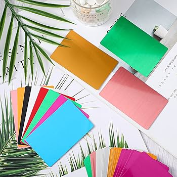
Here’s the thing: metal already signals premium. Thickness decides which flavor of premium.
– Thinner (≈0.3, 0.5 mm) feels modern, precise, techy. Like “we’re efficient and design-led.”
– Mid-range (≈0.5, 0.8 mm) feels confident and balanced. Most industries win here.
– Thicker (≈0.8, 1.0+ mm) is loud luxury. It says “high-ticket” even before someone reads your name.
I’ve seen thick cards work brilliantly for boutique real estate teams and high-end fabricators. I’ve also seen them backfire for consultants who need their card to slip into a wallet without turning into a “thing.”
If you only follow one framework, use this 6-step reality check
Not a neat checklist kind of day, but this one saves people from bad orders:
- Decide what the card should imply: minimal, bold, elite, industrial, refined.
- Picture where it ends up: wallet slot, phone case pocket, desk tray, purse.
- Pick material before you lock thickness (different metals behave differently).
- Match thickness to your design density: small type + detailed logo needs stability.
- Choose edges with intent: edges can rescue comfort on thicker stock.
- Handle samples in real life: under office lighting, in a jacket pocket, in a card holder.
Now, this won’t apply to everyone, but if you can’t get samples, at least order a tiny test batch first. Buying 500 “perfect” cards that nobody wants to carry is a special kind of regret.
Material ranges that actually work (not theoretical)
Different metals hit different “feels right” zones. These aren’t laws, but they’re reliable starting points:
– Aluminum: 0.3, 0.6 mm
Light, clean, usually the best for slim modern cards. Too thick and it starts feeling oddly chunky for what it is.
– Brass: 0.5, 0.8 mm
Brass wants a little mass. The warmth and color read more premium when it has presence.
– Stainless steel: 0.4, 0.9 mm
Tough, crisp, durable. It can go thinner than people think if your edge finishing is good.
A specific data point, since people ask: common “credit card” plastic is roughly 0.76 mm thick (ISO/IEC 7810 ID-1 standard). Source: ISO/IEC 7810. That doesn’t mean you must match it, but it’s a useful reference because wallets are built around it.
Durability isn’t just “will it bend?”
Thickness helps with stiffness, sure. But what kills metal cards in the wild is usually more mundane:
– edge nicks from bouncing around with keys
– corner dings from being shoved into tight slots
– finish wear from constant rubbing and finger oils
Thicker cards reduce flex, and flex is what turns tiny edge defects into visible damage over time. Still, I’d rather have a well-finished 0.5, 0.6 mm card than a sloppy 1.0 mm slab with burrs.
Also: if your card feels like a weapon, people handle it like one. They don’t keep it. They “show it,” then it disappears.
Engraving, laser etching, printing: thickness changes the outcome
Look, engraving depth isn’t unlimited. If you go very thin, you’re forced into shallower marks, which can reduce contrast, especially on intricate logos or tiny text.
A practical way to think about it:
– Thin stock tends to favor simple graphics and high-contrast finishes.
– Mid-range thickness is the most forgiving for fine linework and legibility.
– Very thick stock holds detail well, but micro-scratches can become more noticeable on big flat surfaces (depending on finish).
In my experience, the most “expensive-looking” result comes from pairing mid-range thickness with a finish that controls glare. Polished metal can be gorgeous, but it’s also a fingerprint billboard.
Edges: the hidden lever people forget
Edge style isn’t decoration. It’s ergonomics and durability pretending to be aesthetics.
Thin cards (around 0.3, 0.5 mm) usually do best with flat, clean edges. Too much bevel on very thin stock can make corners feel weak.
Thicker cards (around 0.8 mm+) almost beg for comfort tweaks:
– Rounded corners reduce pocket snagging and corner stress
– Chamfered edges add “machined” premium feel
– Beveled edges catch light and make a card look more dimensional
One-line emphasis: If you go thick, soften the geometry.
Storage and presentation: the boring stuff that decides if it survives
A metal card without a storage plan turns into a scuffed prop fast.
If you’re handing these out frequently, use a simple routine:
– keep them in a sleeve or rigid holder
– wipe occasionally with a microfiber cloth (especially polished finishes)
– don’t let them rattle around loose in a bag
Moisture matters too. Stainless is forgiving. Brass and some plated finishes can be more temperamental in humid or salty environments.
“Feel testing” that isn’t just vibes
Grab 3, 5 samples across thicknesses and do this:
Hold each card by the corners and give it a slight flex (don’t try to bend it like a paperclip, just a gentle stiffness test). Tap it lightly on a desk. Slide it in and out of a wallet slot. Do that under harsh overhead lighting, because glare exposes weak finishing.
Then write down what you felt immediately. Not later. Your first impression is basically the customer’s impression.
A blunt decision chart (because sometimes you just want the spec)
Choose ~0.3, 0.5 mm if you want:
– sleek, modern, minimal
– lighter mailers and easier carry
– a “precision” vibe over “heirloom object” vibe
Choose ~0.5, 0.8 mm if you want:
– the safest premium feel
– good support for engraving/etch detail
– compatibility with normal card storage
Choose ~0.8, 1.0+ mm if you want:
– statement-piece heft
– maximum rigidity and desk presence
– a card people talk about (but might not store)
Measuring thickness and validating a batch (quick, practical)
Calipers or a micrometer. That’s the tool.
Measure multiple points on each sample card: center, edge, and near corners. Average the readings, and keep notes. If you’re ordering at scale, ask your supplier for stated thickness tolerance and confirm with a small pilot run. Variations show up in stacking, fit, and even engraving consistency because light reflects differently when surfaces aren’t uniform.
And yeah, you’ll feel a 0.1 mm shift more than you think.